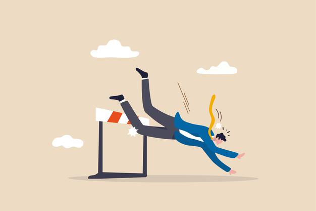
no matter how hard you try to make everything right, sometimes just some website of elopement Miss takers will turn your website down. A website is supposed to increase the traffic, leads, and sale of your products, But in some cases, it simply doesn’t.
That’s why you need to look for common web development mistakes you might have made. Let’s take a look at these common mistakes and learn whether you have met them before or not.
let your webdesigner know about these mistakes

Not having a responsive design
It is fair to say that not having a responsive business website design is bad as not having a website in 2021. today uses on very different sort of devices. You should make your website accessible to all of them.
Let’s face it; it is really annoying to watch a desktop website on a mobile device. So make sure mobile users have the same experience with your website as desktop users. Otherwise, Google will punish you.
4.72 billion people all around the world are using the internet in 2021. At the same time, 92.8% of internet users prefer mobile devices to go online.
Do you need more information to avoid these types of website development mistakes?
404 pages
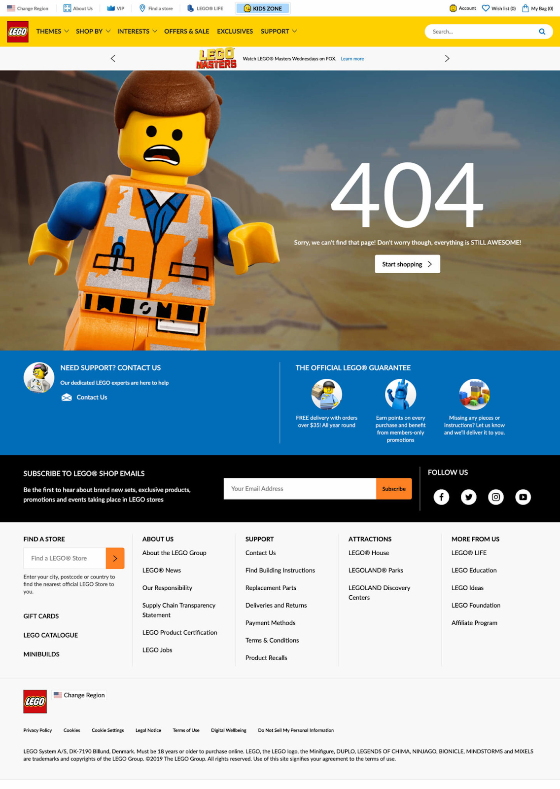
There is nothing more annoying than 404 pages. It is like being doomed. No one likes to see these pages, and just a few users will try to solve the problem. Most of them will just leave your page and try another website.
But with some creativity you can make this annoying experience to a fun one. Just like Amazon, Medium, and Lego did.
Take a look at these ideas for 404 pages

Loading time
If it takes too much to load your website, you will lose visitors every few seconds. And this will be one of the first website development mistakes you made. Visitors do not wait more than 4 seconds for your vet page to load completely. In fact, 40% of people will leave your website if it takes more than 3 seconds to load.
To get the highest rank on a search engine result page, you need to have a shorter loading time.
Unreadable website
In some cases, web designers use multiple colors and forms to make an extractive website, which just ruins your credibility. Because you cannot read this type of website easily. So no worries better to use the simpler font and medium text sizes to avoid misunderstanding. I’m not going to argue with you because you might find this font quite attractive:

But it is kind of hard to read. A specialist web design company, will advise you to use simpler fonts. Because you have to make it easier for your visitors to understand what you are talking about. Our experience as a website development company shows that people are a fan of simplicity, no exaggeration.
It is hard to scan the content
It seems that users stay on your website for less than 15 seconds. But it doesn’t mean you shouldn’t provide your visitors with high-quality content. But you might create scannable content.
How are you supposed to do that; by:
- Attractive sub-headings
- short paragraphs
- highlighted formatting
- numbered lists or bullet points
You have to admit that some visitors scan your text to find what they are looking for. Ignoring that will be another website development mistake in your business.
In a nutshell
Web design and development It’s not just about visual appeal. You should ask your web designer for so many things and not just responsive website design. It is essential to have a responsive web design, but the most important thing is to keep visitors for as long as you can on your website. We have talked about some common web design mistakes to avoid misunderstanding.
If you’re experiencing less traffic day-by-day on your website, do something about it
Sources:
- DIGITAL AROUND THE WORLD. Fareportal
- 404 Page Not Found (Is This Your Company’s Worst Nightmare?). flinnwestsolutions
https://flinnwestsolutions.com/404-page-not-found-nightmare/
- How Loading Time Affects Your Bottom Line.neilpatel
https://neilpatel.com/blog/loading-time/
- The 15 Second Rule: 3 Reasons Why Users Leave a Website. (May 14, 2020). crazyegg
https://www.crazyegg.com/blog/why-users-leave-a-website/
- 32 Things You’re Doing Wrong With Your Website Design. neilpatel
https://neilpatel.com/blog/website-design-mistakes/
- 8 Website Design Mistakes That Will Kill Your Business. (March 20, 2018). atelierlks
https://atelierlks.com/8-website-design-mistakes-that-will-kill-your-business/
- 6 COMMON WEB DESIGN MISTAKES THAT CAN KILL YOUR WEBSITE. thechasedesign


 by PurpleZ
Leave a Reply